Choosing a Cohesive Colour Palette for Every Room
A home feels more considered when its rooms relate to one another, even if each has its own character. A cohesive colour palette creates that connection without requiring every wall to be the same shade. The key is to choose a small group of colours that work together, then adjust their balance from room to room.
Start with the whole home
Before choosing paint, look at the home as a complete space. Note which rooms connect visually, where sightlines run through doorways, and which fixed elements will remain, such as flooring, stone, tiles, cabinetry or large pieces of furniture. These features already contribute colours and undertones, so the palette should work with them rather than compete.
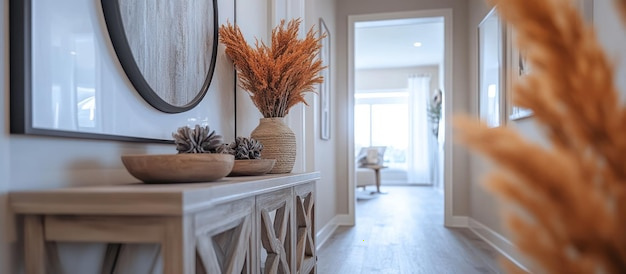
Decide on the atmosphere you want overall. Soft, muted colours can create a calm impression, while deeper or more saturated shades bring greater contrast. There is no need to make every room feel identical; a consistent underlying mood is enough to create continuity.
Build a simple palette
A practical palette can include:
- A principal neutral for larger areas or rooms that need a quiet backdrop.
- A secondary colour to add variation while remaining compatible with the main neutral.
- One or two accent colours for smaller areas, furnishings or details.
Consider the undertones as well as the colour names. Two shades described as grey, beige or white may look noticeably different beside one another if one feels warmer and the other cooler. Compare samples together, and check them against the materials already in the room.
Let light guide your choices
Colour changes with the light around it. A room’s orientation, window size, nearby buildings and artificial lighting can all affect how a shade appears. In England, natural light also varies through the day and across the seasons, so a colour that looks balanced in bright daylight may feel different on a dull afternoon or under lamps.
Test paint samples on more than one wall, ideally on large pieces of card that can be moved around. Look at them at different times of day and with the lighting you use in the evening. This helps you judge the colour in context rather than relying on a small sample or an image on a screen.
Create connection, not repetition
Use colour to guide the eye from one space to another. A shade from the main living area might reappear in a hallway detail, a bedroom textile or a painted piece of furniture. Repeating a colour in small ways can make adjoining rooms feel related without making them look alike.
For rooms that are visible from one another, check that the colours sit comfortably together. They do not have to match, but abrupt changes in undertone or intensity can make the transition feel unsettled. A shared neutral, a related accent or consistent wood and metal finishes can help bridge the difference.
Give each room a suitable variation
The function and natural character of a room can shape how the palette is used. A quiet bedroom might use softer versions of the home’s colours, while a dining area could take a deeper tone from the same family. In a compact hallway, a lighter shade may help maintain a sense of openness; a darker colour can also work when a more intimate effect is intended.
Treat these as choices rather than rules. The best colour depends on the proportions of the room, its light, the furnishings and the feeling you want to create.
Check the details before committing
Paint sheen, flooring, textiles and trim all influence the final result. A glossy surface reflects light differently from a matt one, and a white trim can make a wall colour appear stronger by contrast. View samples beside the materials and finishes that will remain in the space.
It can also help to limit the number of competing colours and finishes. If a room already has patterned flooring or a prominent piece of furniture, a quieter wall colour may let those features stand out. Where the room is simpler, colour can provide the focus.
A cohesive palette is not a fixed formula. It is a considered set of colours that responds to the home’s light, materials and layout. By testing shades in place and repeating them thoughtfully, you can create rooms with individual character and a sense of connection throughout the home.