Creating Calm, Timeless Living Rooms with Pale Stone Interiors
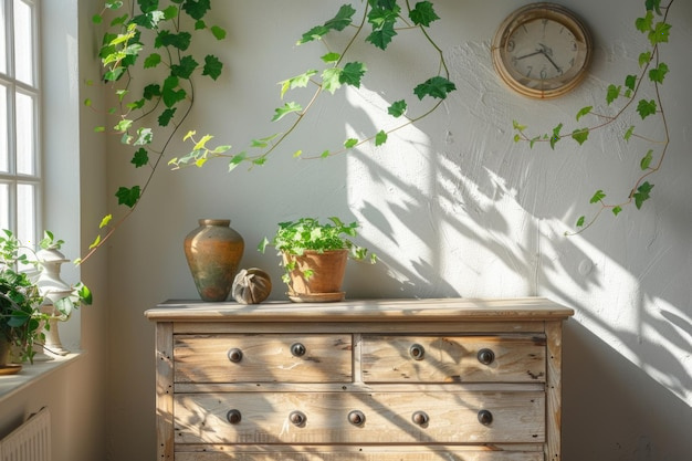
A calm living room does not have to feel sparse or formal. The most enduring spaces balance soft colours, comfortable furnishings and personal details, creating a room that feels welcoming now and remains easy to live with over time.
Begin with a considered colour palette
Pale stone shades make a versatile starting point. Warm whites, muted greys, sandy beiges and soft taupes can work together without making the room feel flat. Before choosing paint or fabric, consider the room’s natural light: a colour may appear cooler in a shaded space and warmer where sunlight reaches it.
Use a small number of related tones across walls, upholstery and larger furnishings. Then add contrast through darker wood, a fine-lined metal detail or a deeper accent colour. Keeping strong colours to a few changeable pieces—such as cushions, artwork or a throw—makes it easier to refresh the room without redesigning it.
Choose materials with texture
A restrained palette benefits from tactile variety. Linen, wool, natural timber, stone and woven finishes can bring depth to a room while keeping its overall look composed. Combine smooth and textured surfaces rather than relying on colour alone: a soft rug, a timber coffee table and lightly textured curtains can each add interest without competing for attention.
When selecting materials, think about how the room is used as well as how it looks. A family living room may call for practical, easy-care upholstery, while a less frequently used space might accommodate more delicate fabrics. Samples viewed in the room can help you judge how finishes relate to one another in changing light.
Plan the layout around everyday life
Start by considering the room’s main activities. Conversation, reading, watching television and entertaining may all require different arrangements. Position seating so people can speak comfortably, and leave clear routes through the room. In a smaller space, fewer well-proportioned pieces can feel more relaxed than several bulky items.
A rug can help define the seating area, while a side table within easy reach makes a sofa or armchair more useful. If the room has a focal point, such as a fireplace or a window, arrange furniture to acknowledge it without making movement difficult. The best layout is not necessarily symmetrical; it is one that feels balanced and works for the people who use the room.
Layer lighting for a softer atmosphere
A single bright ceiling light rarely suits every moment. Combine general lighting with lamps for reading and softer ambient light for evenings. Table and floor lamps can also add warmth to corners that might otherwise feel overlooked.
Choose lighting that complements the room’s materials and scale. In a pale interior, the shade and warmth of the light can affect how colours appear, so consider bulbs in the context of the whole room rather than in isolation. Dimmers, where appropriate, offer flexibility between practical tasks and a quieter atmosphere.
Make room for personal details
Timeless design should feel individual, not generic. Display a few meaningful objects, books or pieces of art, leaving enough open space for each to be appreciated. A natural arrangement often feels more relaxed than filling every shelf or surface.
Before buying something new, consider whether it supports the room’s palette, function or character. This helps keep the space coherent while allowing it to evolve. Pale Stone Interiors can be part of the planning process, helping bring together colour, layout, lighting and finishes into a considered living room. The aim is not to follow a passing trend, but to create a calm, practical setting that feels like home.